PIE CHART
What is Pie Chart? A pie chart (or a circle graph) is a circular chart divided into sectors, illustrating proportion. In a pie chart, the arc length of each sector (and consequently its central angle and area), is proportional to the quantity it represents. When angles are measured with 1 turn as unit then a number of percent is identified with the same number of centiturns. Together, the sectors create a full disk. It is named for its resemblance to a pie which has been sliced. The size of the sectors are calculated by converting between percentage and degrees or by the use of a percentage protractor. The earliest known pie chart is generally credited to William Playfair’s Statistical Breviary of 1801.
When to use :
Its recommended to be used when a piece is to be compared with respect to the total.
Pie charts work particularly well when the slices represent 25 to 50% of the data, but in general, other plots such as the bar chart or the dot plot, or non-graphical methods such as tables, may be more adapted for representing certain information.
– Do the parts make up a meaningful whole? If not, use a different chart. Only use a pie chart if you can define the entire set in a way that makes sense to the viewer.
– Are the parts mutually exclusive? If there is overlap between the parts, use a different chart.

– Difficult to compare individual pieces
– Do you want to compare the parts to each other or the parts to the whole? If the main purpose is to compare between the parts, use a different chart. The main purpose of the pie chart is to show part-whole relationships.
– How many parts do you have? If there are more than five to seven, use a different chart. Pie charts with lots of slices (or slices of very different size) are hard to read.
– While designing pie chart, make sure that slices are mutually exclusive; by definition, they cannot overlap. The data therefore must not only sum up to a meaningful whole, but the values need to be categorized in such a way that they are not counted several times.
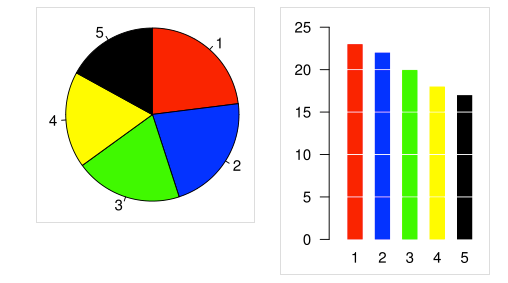
– Research suggests that we look at the angle in the center, essentially reducing the chart to just the crossing lines there. We are not very good at measuring angles, but we recognize 90 and 180 degree angles with very high precision. Slices that cover half or a quarter of the circle will therefore stand out. Others can be compared with some success, but reading actual numbers from a pie chart is next to impossible.
Industry specific examples of Pie Chart Usage :-
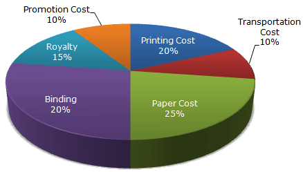
If a company has five divisions, and the pie chart shows profits per division, the sum of all the slices/divisions is the total profits of the company.

Best Open Source Business Intelligence Software Helical Insight is Here
Nice post. I learn something totally new and challenging on
sites I stumbleupon every day. It will always be helpful to read through articles
from other authors and practice a little something from other sites.