This library is used to create a dynamic and interactive data visualizations. C3 is a library build on top of D3. C3 is d3 based reusable chart library and most important advantage of using c3 is that you don’t have to know D3 or write those long codes!. With c3 its very simple to make chart its all there you just have to use it.
Here is Quick demo..
Setup
<script type="text/javascript" src="https://cdnjs.cloudflare.com/ajax/libs/c3/0.4.10/c3.min.js"></script>
<script type="text/javascript" src="https://cdnjs.cloudflare.com/ajax/libs/d3/3.5.12/d3.js"></script>
<link href="https://cdnjs.cloudflare.com/ajax/libs/c3/0.4.10/c3.css" rel="stylesheet" type="text/css">
C3 code
Create an Element to bind the chart.
<div id = "chart"></div>Creating a bar graph
var chart = c3.generate({
    data: {
        columns: [
            ['data1', 30, 200, 100, 400, 150, 250],
            ['data2', 130, 100, 140, 200, 150, 50]
        ],
        type: 'bar'
    },
    bar: {
        width: {
            ratio: 0.5 // this makes bar width 50% of length between ticks
        }
        // or
        //width: 100 // this makes bar width 100px
    }
});
If we want to draw line chart we can just change the type, we can also add new features like new axis customize the charts,change colors etc. For more information please refer website C3JS.
The chart for above code is
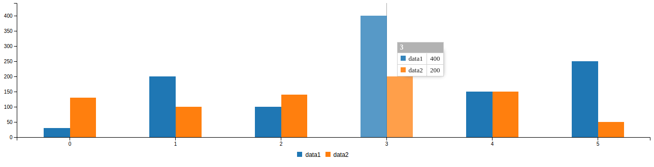
One can give data in Column Row or in Json form. we used generate() function to generate chart.
You can also create multiple graphs one chart like this..
var chart = c3.generate({
    data: {
        columns: [
            ['data1', 30, 200, 100, 400, 150, 250],
            ['data2', 130, 100, 140, 200, 150, 50],
            ['data3', 300, 200, 160, 400, 250, 250],
            ['data4', 200, 130, 90, 240, 130, 220],
            ['data5', 130, 120, 150, 140, 160, 150],
        ],
        axes:{
          data2:'y2' //creating an extra y-axis
        }
        type: 'bar',
        types:{
          data3: 'spline',  //data3-spline
          data4: 'line',      //data4-line
          data5: 'area',      //data5-area chart
        }
    },
    bar: {
        width: {
            ratio: 0.5
        }
    }
});
The chart will be like this


Best Open Source Business Intelligence Software Helical Insight is Here